Monday, November 16, 2009

Artist Book Structure

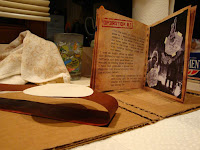
I wanted to continue working with handheld handbooks, like with my recipe booklet. This booklet will be a bit bigger, however: 5 x 5 inches. I plan on printing it double-sided like a standard book and sew it together in the middle. I haven't decided on a paper yet, but I'm looking into matte finishes. possibly. The covers with be a dark red with cats on the front and back. The text faces I am using is a Russian Advertisement type titled Kremlin for all the titles and headers. I am also using Traveling Typewriter for the text inside the book.

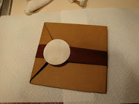
Throughout the book will be images used in my series, isolate on their own on the pages to accompany the text. The series will be held in the pages with an illusion of photo corners constructed in photoshop. The type will be broken into parts like in the recipe booklet for feasible reading. I plan to place the book in a cardboard folder case I will cut and construct by my hand. I'm thinking about spray painting a stencil stamp the reads the German 'Hang in There' title to mirror the title cover page of the book inside.

Print Series- Artist's Statement

World War II has always been an interest of mine. It was a very gruesome and large event that impacted many countries around the world. Using the confinements of the initial words, I fabricated a fairytale of the war to sugarcoat parts that are still hard to consider in present day. My initial approach was to desensitize history through the use of cats, censoring scenes of WWII to make them appear more whimsical, as if a story of war as being explained to a child. To further emphasize the child-like nature of the pieces, I applied my own drawings into the piece crudely held in place my masking tape. It is not a way of laughing at the events of WWII, but looking through a surreal perspective of censorship to separate the viewer from the images.

All the words fit fluidly in my first piece as I began exploring my collage approach to the series in Concept 1. Trying to keep the outer space setting a secondary part to the image, I crowded the moon with burning buildings pulled from WWII scenes. I used an iconic Hitler to specify this particular war. The hand-drawn rafflesia and cats were drawn and scanned on tracing paper to replace a tank and grenades. I placed the fictional LOST character subtly into the soldier’s helmet. His expression accompanied by the cats along with the rafflesia tank creates the whimsical atmosphere I was aiming for.

When I began my second piece, I decided to continue with working on scenes from WWII. I decided I wanted my images to be more cohesive with each other with less random images pasted on top of each other. I stuck with one picture of the London Blitz and inserted three Nazi planes, repeating and resizing them in a pattern that moved across the sky. Instead of bombs, falling cats dropped from the sky. I used the same tracing paper drawing technique and also added some drawn cupcakes to the bottom so the cats did not appear to be falling to a fiery death, but a delicious break to their fall.

The final piece was tough. I really wanted to depict Auschwitz, but the concentration camp seemed to be a very conversial subject to desensitize. I decided not the place in the mass graves but stick to the more subtle approach I’ve been using. The smoke in the background suggests the crematories in progress, but it is not the focus. I found a walkway scene from Auschwitz and decided to cover it with many cats roaming about the aisle. I inserted the iconic Auschwitz gate over the walkway to tell the viewer where we are, but hung a drawn ‘Cats 4 Sale’ sign underneath to shift the idea of a terrible camp into a curious place filled with cats.

Love is a Four-Letter Word

Love is a Four-Letter Word
By Andrea Mastrovito
The Foley Gallery, New York, NY
11-11-09


Andrea Mastrovito's exhibit appealed to me because she was working in a method similar to my series project; using collage. I was immediately drawn in by the diptych Firing Squad by the use of space and color. The backgrounds are strictly kept to cool blues while the foreground is exploding in warm reds and yellows and white. The cut-out shapes worked well in her pieces. They act as voids the viewer is encouraged to fill in using their imagination or own personal life. Letters of L, O, V, and E are scrambled in each scene, depending on the image, it either fills up a body or acts as the ground or both.

The series works because it is about visually depicting the concept of Love. Love may be a four-letter word, but it is not a simple definition. Mastrovito utilizes a concept of a series to explore different kinds of loves and how love is really in the ey of the beholder. Take Doggy Style for example, there is one dog filled with the letters of love mounting this blank dog who is looking away. By not seeing the animal's face and by observing it's absence of those letters, we begin to question the story behind the work. One may say the white dog's feelings are not consensual with the other or perhaps the white dog is overcame with a sense of shame or guilt that forces it to shy away from the viewer. This technique really engages the viewer to formulate their own conclusions within each piece.

Her exploration of love expands beyond just sex and intimate relationships. In the series, we can observe the love for war, the love of sacrifice, the love in salvation, the love of the hunt, the love of running away, and so much more. Others viewing the show may read each image as a different kind of love compared to my interpretations depending on their own personal connections with the work.
Print Series

I was able to use all 7 words in my first print of the series. I focused on the time period of World War II and utilized my words to fabricate a surreal environment that displaces the viewer from the scene at hand. I constructed a collage element to create an image of WWII. I decided to use hand-drawn objects as a censor tool to cover up gruesome parts of war. The concept behind my series was to desensitize history through the use of cats; a quirky sugarcoated fantasy as if the war was envisioned by a child.
I continued with the theme of WWII in my next two prints. Instead of the photoshop aesthetic collage, I tried to focus more on using a specific photo from the scene and adding only a few elements cut-out and drawn. I felt the images were less cluttered and more conceptually engaging to the viewer. The hand-drawn cats on tracing paper became the bombs or the imprisoned jewish rather than simply and object to cover it up.


The series is posted below in the order of development to see the progress evolved as one print moves to the next.


Monday, October 5, 2009

Lists for Project 2

Places: Ocean, Outer Space, Russia
Eviornmental Conditions: Tornadoes, Snow, Meteor Shower
People: Daniel Faraday, Jeffrey Dahmer, The Doctor
Mood/ Feelings: Phenomenal, Furious, Whimsical
Object: Phone Booths, Daleks, Cats
Flora/ Fauna: Venus Fly Trap, Rafflesia, Roses
Period of Time: Jurassic, World War II, AD79 (Vesuvius)

Final Listings: Outer Space, Meteor Shower, Daniel Faraday, Whimsical, Cats, Rafflesia, and World War II

Recipe Booklet


Monday, September 14, 2009

Recipe Booklet Idea

My idea for the how-to assignment was to take a humorous spin on a stereotypical tension between and cubicle worker and his or her boss. It's titled "I Accidentally Murdered My Boss: Covering Up the Crime Scene on the Clock" This little booklet is intended to be 7 pages and wallet sized (3.75 x 2.5) for convenience purposes.
I want it to be just simple typed up steps on various paper backgrounds; each accompanied with a spot illustration on each.

Sunday, September 13, 2009

Monday, August 31, 2009

     At the risk of sounding redundant, my name is Meghan Baier and I am currently a fine arts major at TCNJ. I like to consider myself a jack of all trades, embracing all artistic techniques that range from, drawing to painting, printmaking, and digital.
      I used to be an Illustration major at the Maryland Institute College of Art. To the left is an acrylic painting I did based on one of the Maryland highways. I enjoy working with a subject placed in a vast environment. To me, it provides a therapeutic feeling. My mind is always caught up in so many things, I often need to get away somewhere quiet to finally sort my thoughts apart.
     As for the drawing to the below, this was just a quick sketch scanned and colored on the computer. I was coming up with some t-shirt designs for a band. In my free time, I like to illustrate little zines and cards to give to bands for their merch tables.
     I also dabble a little with webwork, here is an unofficial band website I've constructed and illustrated: Someone Still Loves You Boris Yeltsin